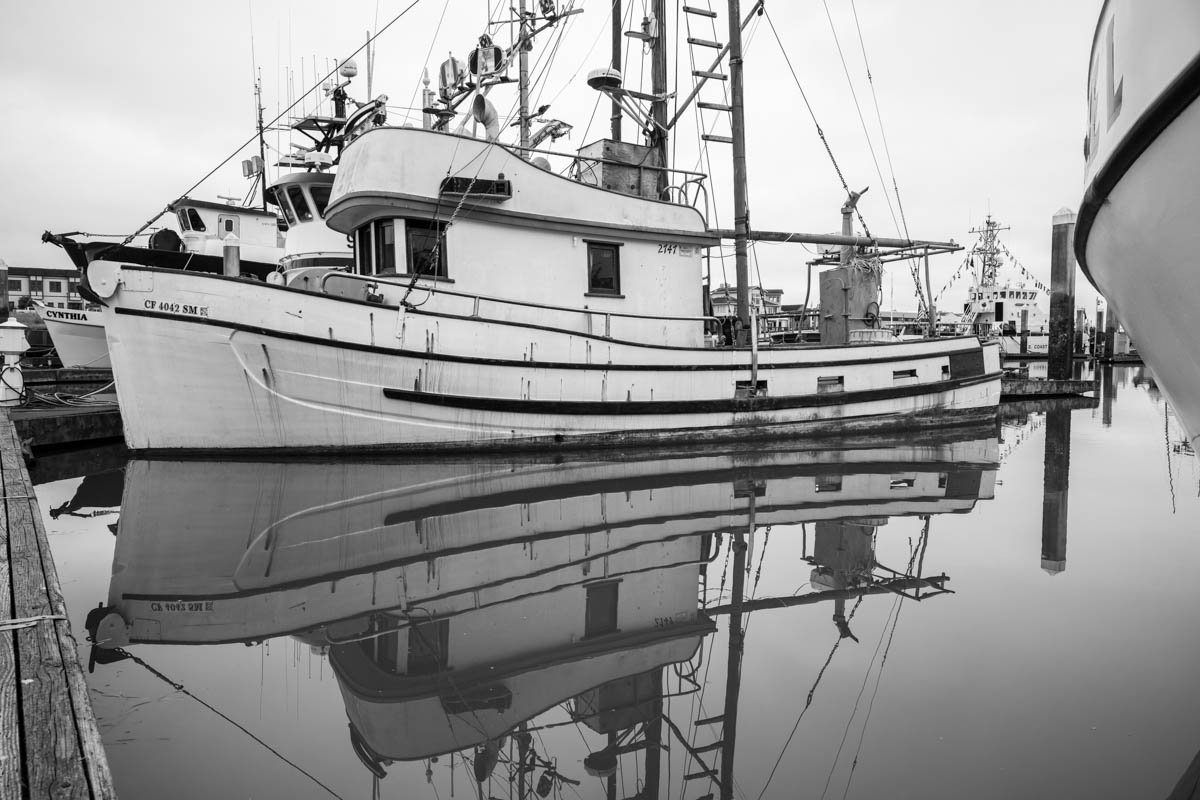
Cool photo. This type of photo works great as a black and white. The portion of the boat, to the right hand side of the screen is a bit distracting though, you may want to crop that out, or clone it out. Overall good job though.
Photofuffle is new and still taking shape. Tell us what's broken or what you'd change.
Before you can post here, you critique someone else's work — real feedback, not a like. That's not a toll. It's how the people on this wall got better, and how you will too. How it works.
First critique on a photo earns two credits instead of one. Three credits lets you post your own.
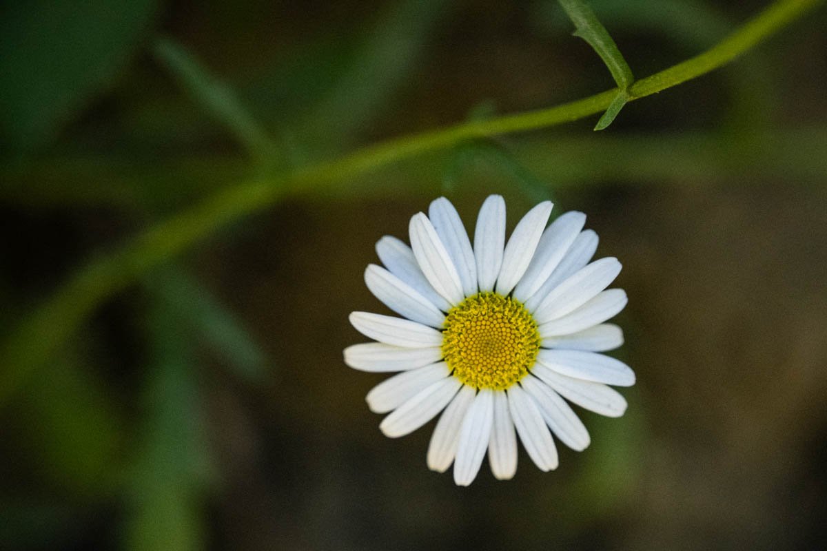
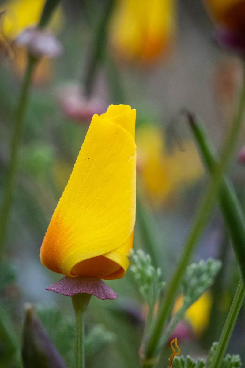
White Flower Closeup
andrewjwd_admin asked: “Please let me know how I might improve this photo, thanks!”
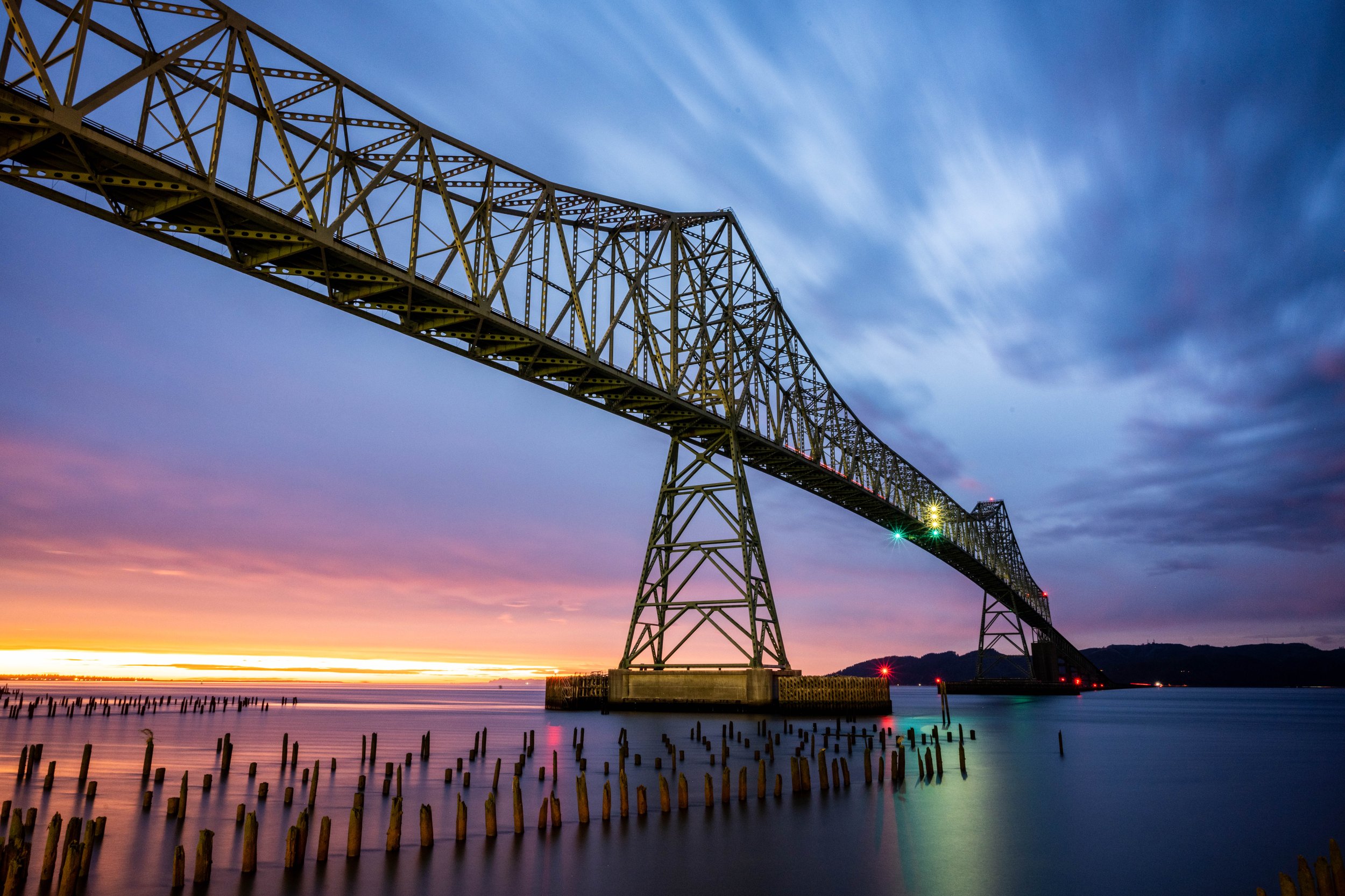
Astoria-Megler Bridge - Astoria Oregon
andrewjwd_test3 asked: “I like the colors in this photo, but just feel like I can't get the composition/crop just right, any suggestions? Also, open to any other critiques. Thanks!”
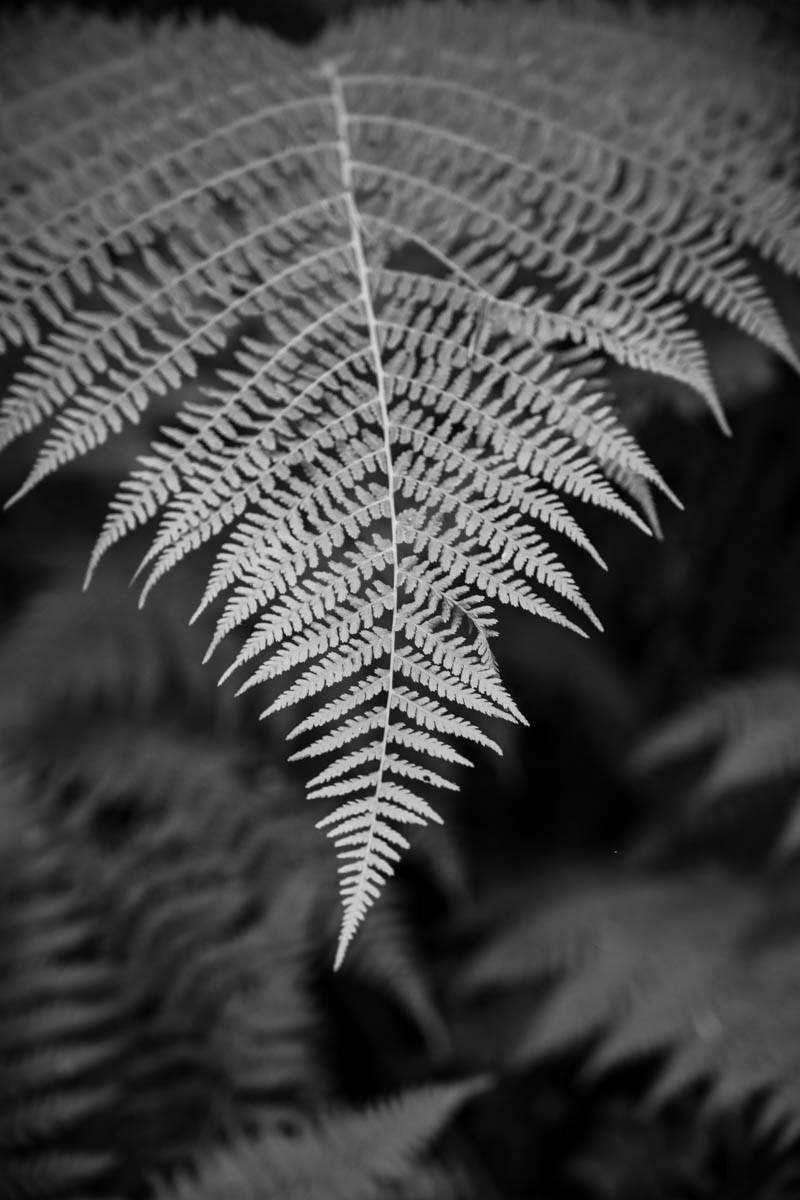
Fern in Black and White
andrewjwd_admin asked: “Any constructive criticism would be appreciated. ”
Cool photo. This type of photo works great as a black and white. The portion of the boat, to the right hand side of the screen is a bit distracting though, you may want to crop that out, or clone it out. Overall good job though.
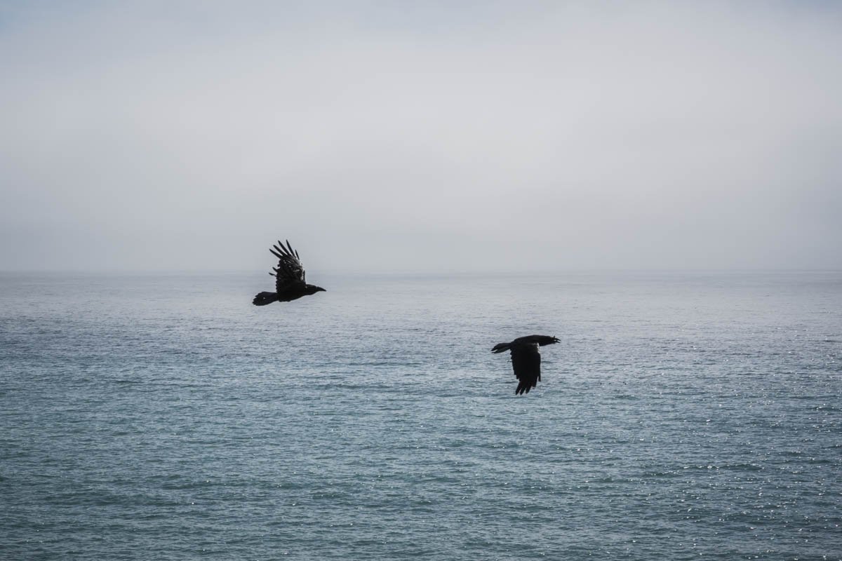
What a wonderful photo. Simple, yet elegant. The top half of the photo is slightly empty though.
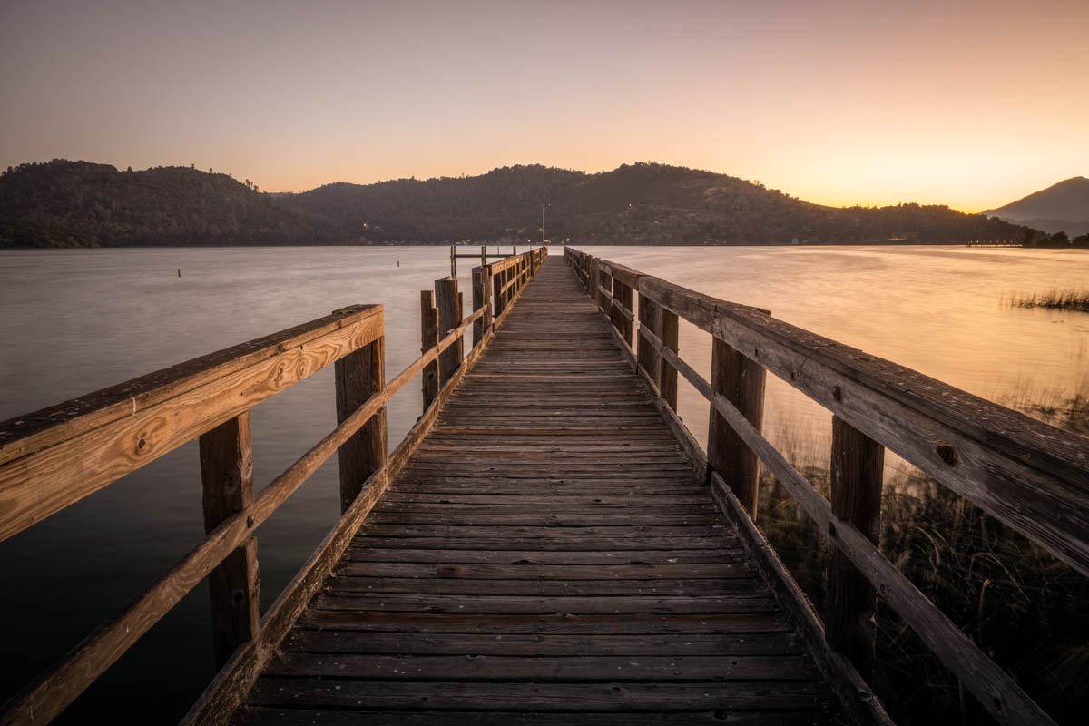
Coming at this from a different angle than the composition note above. I do not mind the central placement — symmetry is a legitimate structure and this frame is close enough to symmetrical that pushing it off-centre might read as an accident rather than a decision. The thing I would actually change is the depth of field. Everything is sharp from front to back, which flattens the picture into a diagram of the scene rather than an impression of being in it. Opening up two stops and letting the background go soft would separate the subject and give it somewhere to sit.
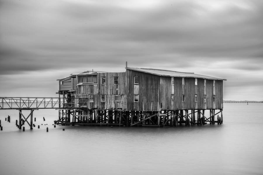
This is the kind of picture that rewards sitting with it, which is not something I say often. The structure is quiet and the tonal range is narrow on purpose, and both of those are choices that take some nerve. If I were being demanding I would say the bottom left corner is slightly muddier than the rest and could take a local lift of maybe a third of a stop. But that is a refinement, not a correction. The photograph is already made.
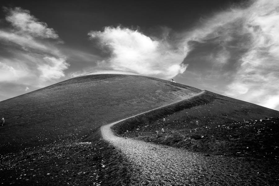
Agreed on the timing, and I want to add something about the shutter speed, because I think it was a more interesting choice than it might look. You have let the moving element blur just slightly — not enough to read as a motion-blur effect, but enough that it is visibly softer than the static parts of the frame. That gives the picture a sense of duration that a completely frozen version would not have. Whether that was deliberate or not, it is working, and I would keep doing it. The thing I would change is the framing at the bottom, where you have included about an inch of foreground that adds nothing and slightly destabilises the composition. Everything above it is composed with care. Crop to the base of the main subject and the frame becomes much more deliberate.
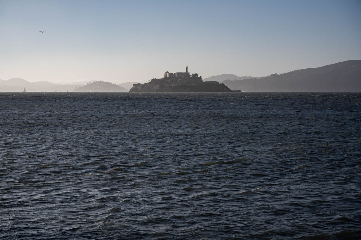
Strong frame. The thing I keep coming back to is how much the tonal separation is carrying — you have given yourself real blacks and real whites without crushing either end, which is exactly the discipline this kind of image needs. My one reservation is the right edge, where a bright shape sits close enough to the border to pull the eye out of the picture. A centimetre of crop would fix it.
There is a real photograph in here and I think you are one decision away from it. The light is genuinely good — that late, low, slightly cold quality is hard to find and harder to wait for, and you clearly waited. The subject placement is confident. What undercuts it is that the frame is trying to hold two ideas at once. There is a landscape picture about the ridge and the weather coming over it, and there is a detail picture about the texture in the foreground rocks, and neither one wins. When I cover the bottom quarter with my hand the rest snaps into place immediately; when I cover the top half, the foreground becomes a much stronger abstract than I first gave it credit for. Both are worth making. I would go back and shoot them as two frames rather than trying to reconcile them in one. On the technical side the only thing I would change is the white balance, which is a touch too blue for the warmth that is obviously in the scene. Pull it two or three hundred kelvin warmer and the whole thing settles.
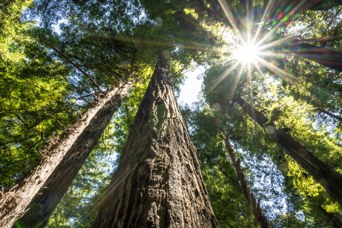
I want to push back gently on the previous note about cropping the sky, because I think the emptiness is the subject here rather than a flaw in it. What the frame is actually about is scale, and you only feel scale if something in the picture is allowed to be vast and uninterrupted. That said, the exposure is doing the composition no favours. The midtones are compressed into a narrow band and everything reads slightly grey, which flattens exactly the depth you are trying to show. If you have the raw file, try pulling the black point down and letting the foreground go genuinely dark. Contrast will do more for this frame than any crop will.